Mastering Modern Cover Design Techniques and Trends
Introduction
A compelling book cover acts as a silent ambassador for your work. Before a reader even turns the first page, they judge the quality of the content by its visual presentation. Designing a cover that captures attention while communicating the core message is an art form that requires an understanding of current visual preferences. In this article, you will learn about the latest graphic strategies, typography rules, and layout trends that make publications stand out on crowded physical and digital shelves.

Minimalist Layouts with Maximum Impact
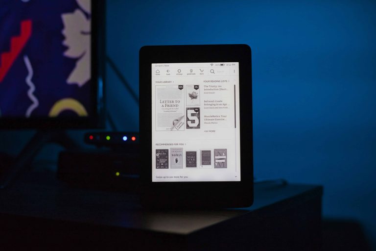
Cluttered graphics often confuse potential readers. Instead, designers are turning toward minimalist layouts to create striking visual statements. By stripping away unnecessary elements, you allow a single image or bold title to command full attention. This approach relies heavily on negative space to give the design room to breathe. Readers appreciate this clarity because it immediately signals what the book is about without overwhelming their senses. A minimalist approach works exceptionally well in digital formats where thumbnails need to be easily recognizable on small screens.
Expressive and Custom Typography
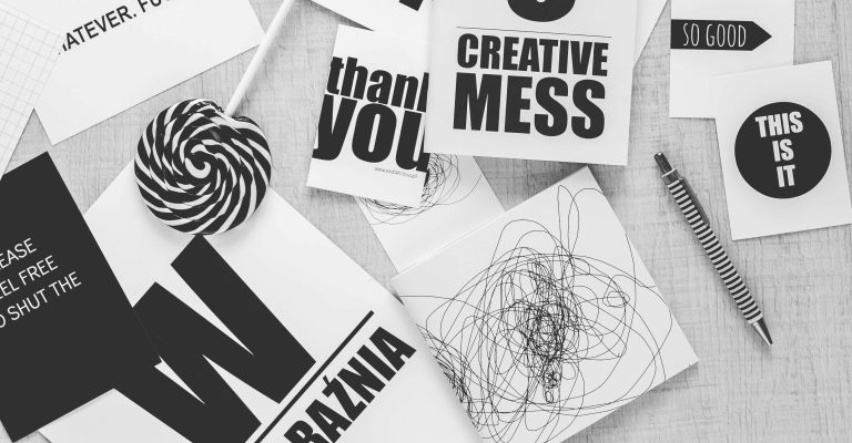
Fonts do much more than display the title. Expressive typography has become a central design element in its own right. Designers frequently manipulate letters to interact directly with the background art, creating a layered effect that draws the eye inward. Hand-drawn lettering is also highly popular right now. Custom text gives a publication a unique personality that standard fonts cannot match. When the title integrates smoothly with the imagery, the entire cover feels unified and professionally crafted.
High-Contrast Color Palettes
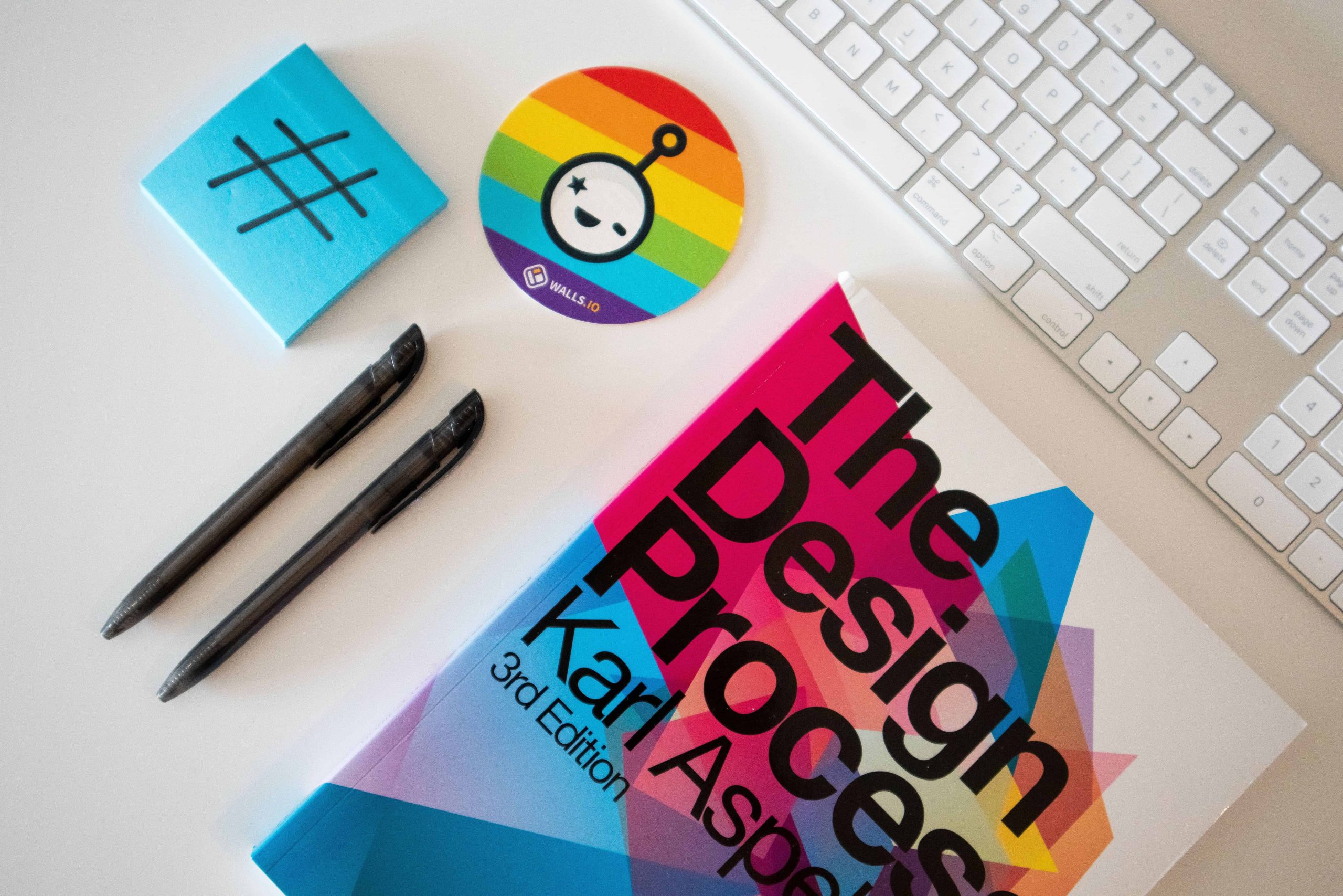
Color choices heavily influence a reader’s emotional response. Currently, high-contrast color palettes are dominating publishing markets. Neon greens against deep blacks or bright yellows paired with dark purples create visual tension that demands a second look. These bold combinations are particularly effective for thriller, science fiction, and contemporary fiction genres. While subdued tones have their place, energetic color schemes are excellent tools for breaking through the visual noise of online bookstores and social media promotional posts.

Authentic and Textured Illustrations
Standard stock photography is slowly losing ground to custom illustrations. Original artwork gives a book an exclusive feel. Readers respond well to textured, hand-painted styles that add a sense of warmth and authenticity to the physical object. These illustrations often feature abstract shapes or stylized character portraits rather than hyper-realistic scenes. Utilizing original artwork also ensures that your cover looks entirely original, avoiding the awkward situation of sharing a main image with another author in your genre.
Integrating Nostalgic Design Elements
Nostalgia holds a powerful appeal for audiences across various demographics. Many designers incorporate retro elements into modern layouts to evoke specific moods. You will often see 1970s block typography or 1980s neon graphics blended with clean, contemporary formatting. This blending creates a sense of familiarity while keeping the overall aesthetic fresh. Vintage color grading, such as faded sepias or muted pastels, can immediately signal a historical setting or a cozy, reflective narrative style.

Conclusion
Creating a captivating visual wrapper for your content requires balancing artistic expression with market expectations. By observing current preferences like minimalist layouts, bold typography, and vibrant colors, you can design a cover that instantly connects with your target audience. A successful design goes beyond simple aesthetics; it communicates the heart of your message before a single word is read. Taking the time to understand these visual strategies ensures your work gets the attention it deserves. Applying these insights will help your publication stand out on any shelf.
Key Takeaways
- Minimalist designs use negative space to make core visual elements stand out clearly.
- Custom and expressive typography gives your publication a distinct and recognizable personality.
- High-contrast color combinations help books grab attention on small mobile screens.
- Original illustrations provide an authentic feel that standard stock photography often lacks.
- Nostalgic elements like retro fonts create immediate emotional connections with readers.
FAQs
How do I choose the right colors for my book cover?
Select colors based on your specific genre and target audience. Warm tones often suit romance and cozy mysteries, while high-contrast cool tones fit thrillers and science fiction. Always test your color palette in thumbnail size to ensure high visibility online.
Why is typography so important in cover design?
Typography directly communicates the tone of your work. A well-chosen font acts as a visual hook that complements the background art. Custom lettering can make your title memorable and ensure the overall layout looks polished and highly professional to readers.
Should I use photography or illustration for my cover?
Your choice depends entirely on the genre expectations and the specific mood you want to set. Non-fiction often benefits from clear photography, while fantasy and young adult fiction tend to favor stylized, colorful illustrations to capture the reader’s imagination effectively.
Those who are genuinely curious about the financial realities behind the books they read often find it fascinating to explore a detailed examination of fair compensation models for authors and creatives in the Portuguese book industry to better understand how writers and illustrators actually earn their income.