The Art of Typography in Book Publishing: Enhancing the Reader’s Experience
In the world of book publishing, typography plays a pivotal role in shaping the reader’s experience. Typography, simply put, is the art and technique of arranging type for communication. Its historical connection with book publishing is profound, dating back to the earliest manuscripts and the development of printing presses.
The Role of Typography in Book Design
Functionality: Ensuring Readability
The primary function of typography in book design is to ensure readability. Clear and legible fonts are essential for a seamless reading experience. Factors such as font style, size, and spacing greatly impact legibility. Moreover, establishing a hierarchy and visually differentiating text elements like headings, body text, and captions aid in guiding the reader through the content.
Creating Mood and Genre
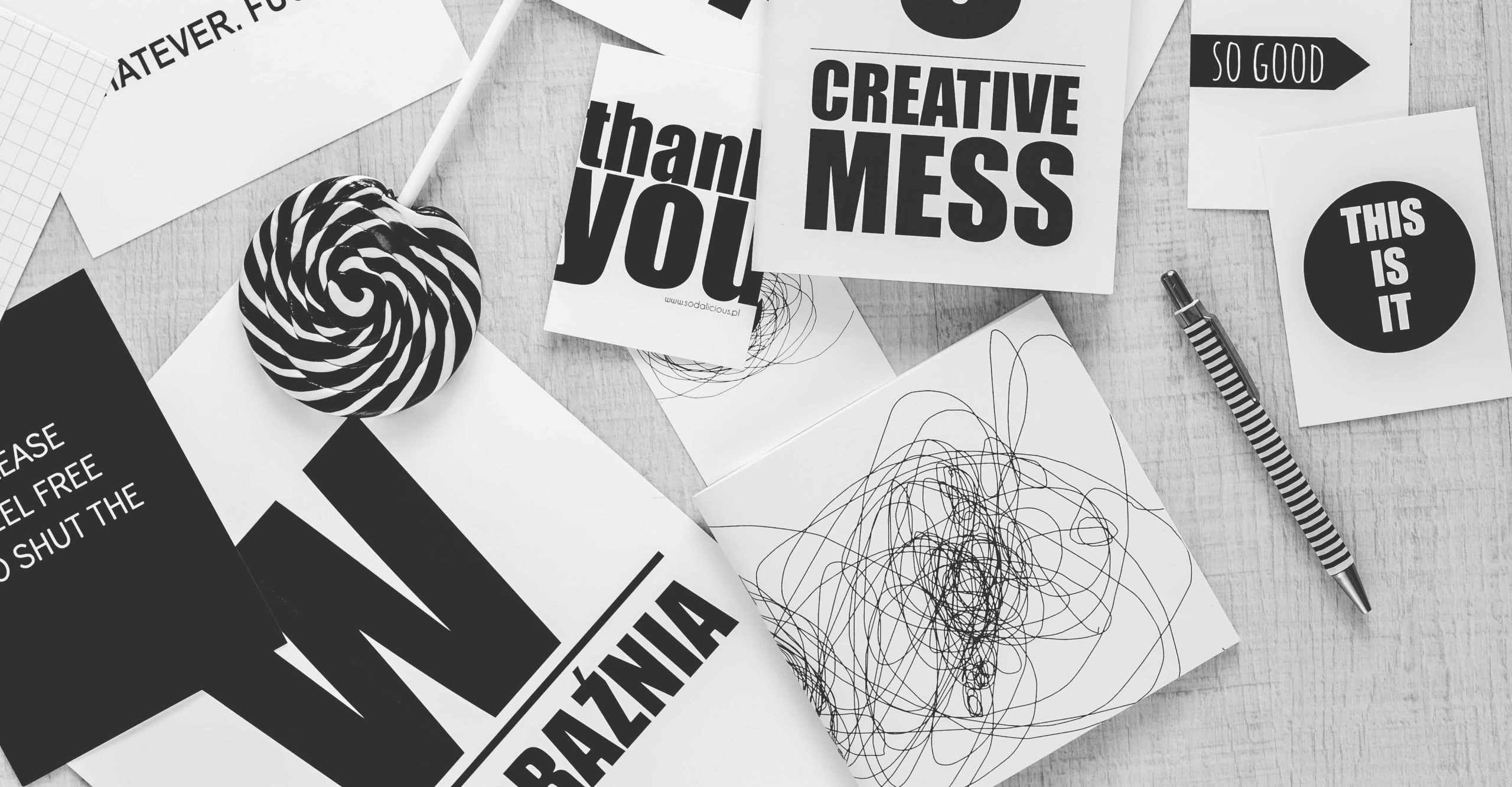
Typography goes beyond functionality; it serves as a powerful tool for creating mood and suggesting genre. The choice of fonts can evoke emotions and set the tone for the narrative. For instance, serif fonts often resonate with classic novels, while sans-serif fonts may be more fitting for contemporary fiction, each contributing to the overall atmosphere of the book.
Establishing Visual Flow and Cohesiveness
Consistency is key in typography for book design. Maintaining uniformity in font usage throughout the book ensures visual cohesion. Additionally, elements like margins, line spacing, and justification play vital roles in creating a visually pleasing layout that enhances the reader’s experience by facilitating smooth navigation through the text.

Key Elements of Typography in Book Design
Font Selection
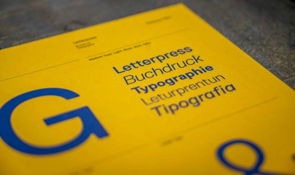
Choosing the right font is a critical decision for typography in book design. Understanding the nuances between serif and sans-serif fonts is fundamental. Furthermore, considering factors such as typeface weight, style, and appropriateness to the genre and target audience aids in crafting a compelling visual identity for the book.
Font Size and Spacing
Font size and spacing directly impact readability. Opting for an appropriate font size ensures comfortable reading, while leading (line spacing) affects the flow of text and readability. Adjusting kerning and the spacing between letters contributes to both aesthetics and clarity, enhancing the overall visual appeal of the text.
Text Layout and Grids
Text layout and grids are instrumental in achieving a structured and balanced design. Utilizing grids helps maintain consistency and coherence across pages. Furthermore, incorporating adequate margins and white space enhances visual comfort and readability, while aligning text elements contributes to a harmonious composition.
Conclusion
In conclusion, typography is not merely a technical aspect of book design; it is an art form that significantly impacts the reader’s experience. By prioritizing functionality, mood creation, and visual coherence, typography elevates the storytelling process, making it more engaging and immersive for the audience. As we continue to embrace the digital age, the art of typography remains a timeless cornerstone of book publishing, enriching literary works for generations to come.
Experience the joy of reading with a clear conscience as we illuminate the path towards a greener, more sustainable future for the world of literature.