Trends in Contemporary Portuguese Book Design: Layouts and Styles
Contemporary Book Design Trends
Book design has always been an essential part of the publishing process, but in today’s visually saturated media landscape, it has become more critical than ever. In the modern era, where competition for reader attention is fierce and visual aesthetics shape first impressions, the design of a book can significantly influence its reception. Beyond mere ornamentation, contemporary book design integrates functionality with creativity, enhancing readability while reflecting the tone, genre, and identity of the content within. It plays a decisive role not only in how a book is consumed but also in how it is marketed and remembered.
This article examines the unique and evolving trends in book design in Portugal, a country with a rich literary tradition and a growing reputation for design innovation. Portuguese designers are forging new paths in book aesthetics by merging historical influences with forward-thinking techniques. With a focus on both layout and style, this analysis will uncover how design trends are being reshaped by cultural factors, technological developments, and creative experimentation.
At the heart of this exploration is the understanding that a book’s layout and visual style are not superficial choices. They are tools that can enhance narrative clarity, engage readers emotionally, and offer immersive experiences that go beyond the written word. We will look at how Portuguese designers are redefining layout conventions, experimenting with new materials, and using modern design tools to challenge the traditional boundaries of the printed book.
The Evolving Landscape of Book Design in Portugal
In recent years, Portugal has seen a notable transformation in its book design culture. This shift is not only aesthetic but also philosophical, reflecting broader changes in publishing and design thinking. Historically, Portuguese book design was heavily influenced by European modernist traditions, with clean lines, functional typography, and restrained layouts. While those roots remain evident, today’s Portuguese designers are taking more creative liberties, blending traditional craftsmanship with digital tools and international inspirations.
One major driver of this evolution is the rapid advancement of digital design and print-on-demand technologies. These innovations have lowered production costs and expanded access to professional design tools, allowing independent publishers and small studios to experiment with formats and styles once reserved for large publishing houses. The result is a flourishing independent publishing scene where visual risk-taking is encouraged and celebrated.
Cultural shifts have also influenced the visual language of Portuguese books. A new generation of designers is more globally connected than ever, drawing from global visual cultures while retaining a distinctly Portuguese sensibility. At the same time, there is a resurgence of interest in local artistic heritage, including azulejo tile motifs, calligraphy, and the ornate aesthetics of historical manuscripts. These elements are being reinterpreted through a modern lens to create unique, culturally resonant design experiences.
This hybrid approach—balancing tradition with innovation—has positioned Portugal as an emerging leader in thoughtful, forward-looking book design.
Contemporary Layout Trends in Portuguese Book Design
Typography as a Visual Narrative Tool
Typography has moved beyond legibility to become a primary design element in Portuguese book design. Designers are increasingly using typefaces not just to convey text but to express emotion and narrative tone. There is a noticeable trend toward the use of custom or niche fonts that offer unique character and personality. These fonts often blend serif and sans-serif characteristics, sometimes incorporating hand-drawn or script elements to add warmth and individuality to the page.
Hierarchy within text is being manipulated to enhance visual rhythm. Large headings with bold or italicized treatments contrast with smaller, denser body text to guide the reader’s eye through the content. This typographic interplay creates a sense of movement and energy on the page, transforming static text into a dynamic reading experience. Furthermore, text is often woven into visual compositions, with letters overlapping images or being shaped around illustrations in creative layouts that emphasize design cohesion.
Grid Disruption and Spatial Experimentation
Portuguese designers are rethinking the traditional grid system, opting for more flexible and sometimes intentionally disruptive layout strategies. Asymmetrical page compositions have gained popularity, with off-center text blocks, irregular column widths, and unexpected placements that challenge conventional reading patterns. These design choices are often used to mirror the thematic complexity of the content or to provoke a more interactive engagement from the reader.
White space is also being used strategically—not as empty filler but as a vital design element that enhances balance, pacing, and focus. Generous use of negative space can make content feel more breathable and refined, while tight spacing and overlapping elements can convey urgency or density. This play between spaciousness and compression adds another layer of narrative texture to the visual presentation of the book.
Visual Integration Within Layouts
Visual elements are no longer limited to inserts or chapter dividers—they are deeply embedded in the layout itself. Photographs, illustrations, and icons are integrated with text to create immersive visual storytelling. This is particularly evident in children’s books, poetry collections, and art publications, where images often appear in conversation with the text, either reinforcing the narrative or offering contrasting interpretations.
Designers are also making use of graphic patterns and textures as background or marginal elements, adding visual richness without overwhelming the primary content. In nonfiction books, infographics and diagrammatic visuals are carefully designed to maintain visual harmony with the surrounding text, ensuring that data presentation supports the overall design language rather than interrupting it.
Contemporary Stylistic Trends in Portuguese Book Design
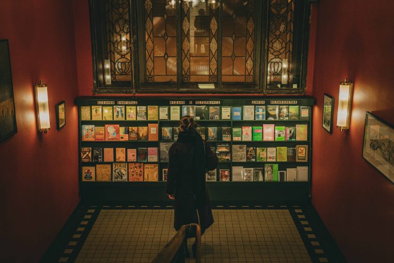
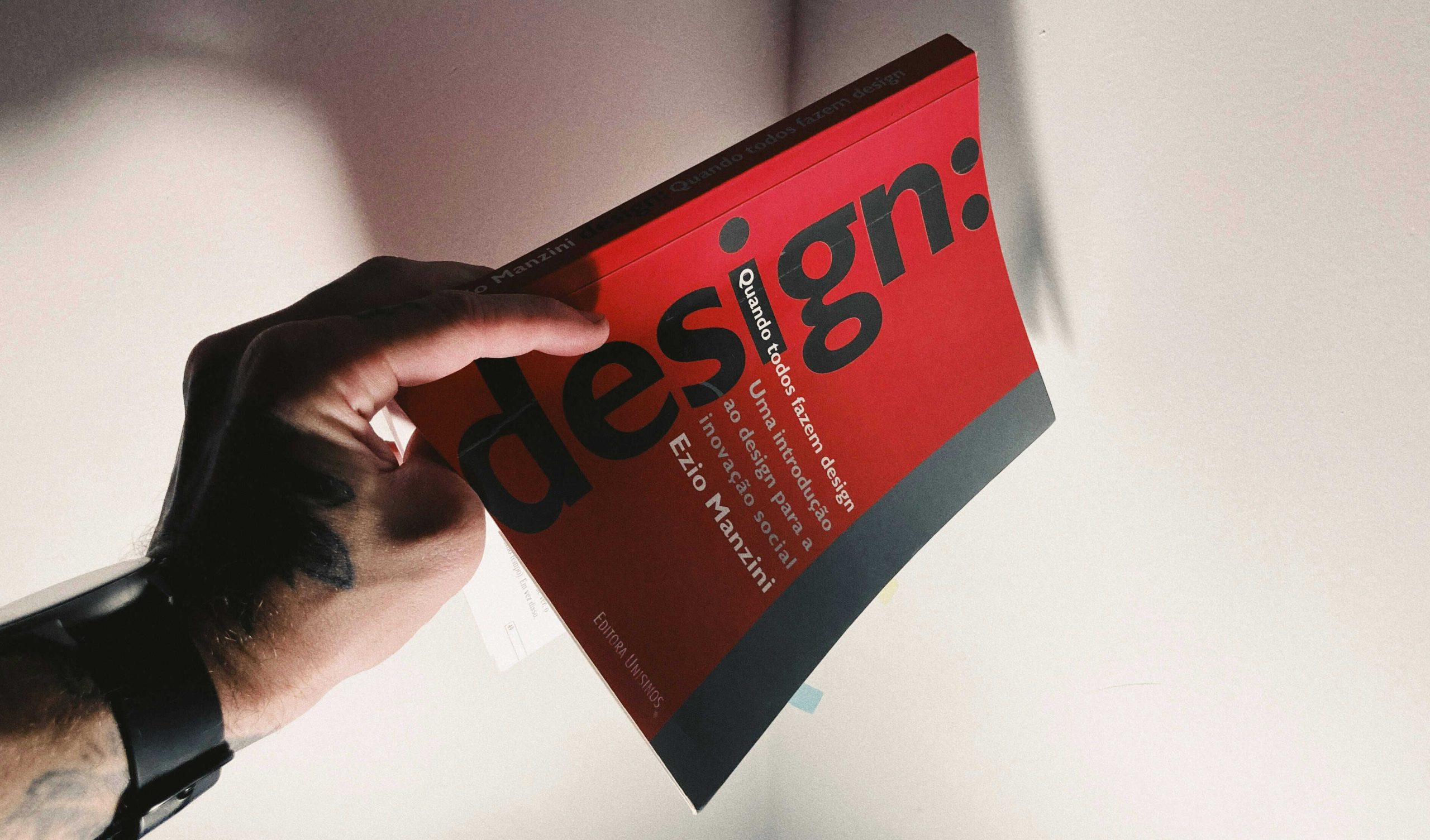
Cover Design as Conceptual Art
Book covers in Portugal have become canvases for conceptual expression. Rather than relying on literal representations of content, designers are using abstraction and symbolism to evoke the themes or emotional atmosphere of a book. Minimalist designs, often with a focus on typography or geometric shapes, are common in literary fiction and poetry. These covers typically employ limited color palettes and sparse imagery, allowing the title and texture of the material to take center stage.
On the other end of the spectrum, bold and expressive covers—featuring vivid colors, layered graphics, or surreal illustrations—are used to capture attention on crowded shelves and digital marketplaces. Portuguese designers often treat the cover as an invitation, hinting at the book’s interior journey without giving too much away. This subtle balance between intrigue and clarity is a hallmark of contemporary design aesthetics in the region.
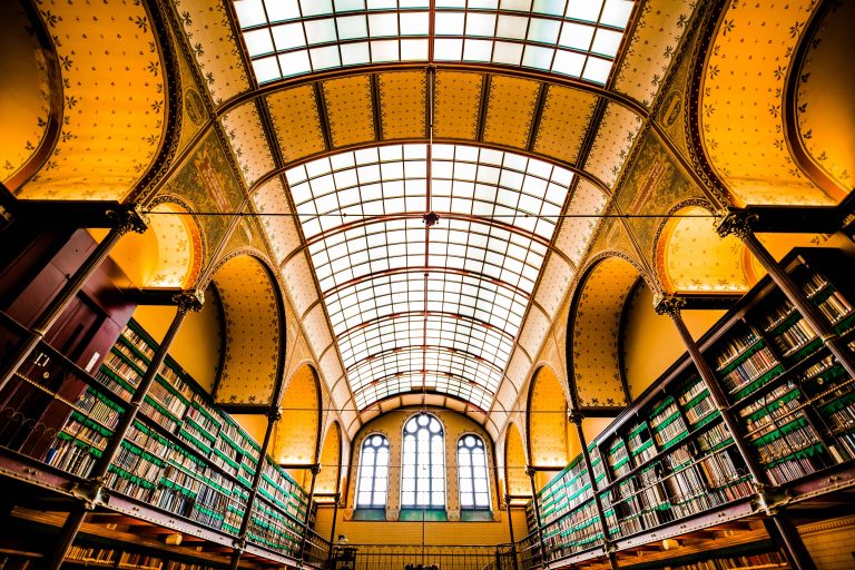
Innovations in Physical Form and Bookbinding
The physical construction of books is receiving greater attention from designers and publishers alike. Traditional glued or stitched bindings are being supplemented with exposed spine techniques, foldouts, gatefolds, and die-cut covers. These choices not only offer tactile and visual interest but also serve thematic functions—enhancing the reader’s experience by aligning the physical structure of the book with its content.
Book dimensions are also being experimented with. Oversized formats are used for photography or art books, while pocket-sized designs are favored for poetry or philosophical texts, emphasizing intimacy. Materials are selected not just for durability but for their sensory qualities. Textured papers, recycled stock, and natural fibers are increasingly popular, driven by both aesthetic and environmental considerations.
Digital Aesthetics in Print
Despite being a print medium, many contemporary Portuguese books reflect the influence of digital design. This is evident in the use of modular layouts, visual navigation tools (such as color-coded sections), and the incorporation of icons and UI-inspired elements. Some designs mimic the interface of apps or websites, especially in publications targeting younger or digitally native audiences.
Additionally, digital illustration techniques—characterized by clean vector lines, vibrant gradients, and stylized forms—are being used to create fresh and contemporary visual languages. Although QR codes and augmented reality features are not yet widespread, there are occasional examples of books that link to multimedia content via scannable codes, allowing the reader to extend the experience into digital space.
The Role of Independent Publishers and Design Studios
Independent publishers are among the most influential forces in shaping the future of Portuguese book design. Operating outside the constraints of mainstream commercial publishing, these publishers have the freedom to prioritize design innovation and artistic experimentation. Many focus on limited-edition runs, handcrafted books, and collaborations with artists that emphasize quality over quantity.
Design studios working within the Portuguese publishing scene often operate with multidisciplinary teams that include illustrators, typographers, and print technicians. These studios are known for their thoughtful and holistic approach to book design, where every aspect—from the typeface and cover design to the binding and paper choice—is carefully curated. Rather than treating design as an afterthought, they embed it into the entire publishing process from the beginning.
Collaborative efforts between designers and writers are also becoming more common, with visual elements developed in tandem with the manuscript. This co-creative approach results in books where form and content are inextricably linked, offering a more cohesive and immersive reading experience.

Conclusion
Portuguese book design today is marked by a spirit of innovation, experimentation, and cultural dialogue. Designers are blending historical influences with cutting-edge practices to create books that are not only beautiful but meaningful. From fluid and expressive typography to bold material experimentation and conceptual cover design, the visual language of Portuguese publishing is evolving rapidly.
The trend toward unconventional layouts and thoughtful material choices is reshaping how readers engage with printed books. These developments reflect a deeper understanding of the book as a multi-sensory object—something to be read, held, and visually explored.
Looking ahead, the future of book design in Portugal seems poised for further creativity, particularly as technology, sustainability, and cross-disciplinary collaboration continue to expand possibilities. As Portuguese designers continue to push the boundaries of what a book can be, their influence is likely to inspire and inform global conversations about the power of design in publishing.
Key Takeaways
- Portuguese book design is evolving rapidly, blending tradition with innovation to enhance both storytelling and visual appeal.
- Typography and layout are now narrative tools, with experimental grids, bold type choices, and creative use of white space shaping the reading experience.
- Visual integration is central, with text and images working together in immersive, genre-specific designs.
- Covers are treated as conceptual art, using symbolism, minimalism, or vivid imagery to convey emotion and intrigue.
- Physical and material experimentation—such as custom bindings and textured papers—adds tactile and thematic depth.
- Independent publishers and studios lead the way, prioritizing creative freedom, sustainability, and collaborative design processes.
- Digital influences are subtly shaping print, from modular layouts to UI-inspired elements and occasional multimedia extensions.
FAQs
What makes contemporary Portuguese book design stand out globally?
Contemporary Portuguese book design stands out due to its blend of tradition and innovation. Designers skillfully merge historical motifs like azulejos with modern layouts, experimental typography, and sustainable materials, resulting in visually rich, culturally grounded, and forward-thinking publications that reflect Portugal’s unique literary and design identity.
How are Portuguese designers using layout and typography to enhance storytelling?
Portuguese designers treat typography as a narrative tool, using custom fonts, dynamic text hierarchies, and asymmetrical grids to guide the reader emotionally and visually. This approach transforms pages into expressive compositions, making layout a storytelling device rather than a neutral container for text.
Why are independent publishers important to book design trends in Portugal?
Independent publishers in Portugal play a key role by embracing artistic freedom, limited-edition formats, and close collaboration with designers. Free from commercial constraints, they innovate with materials, structure, and visuals, helping to redefine what books can look like and how stories can be experienced.
Curious about how to promote books and literary works without relying on manipulative tactics or misleading claims? This article explores the importance of ethical marketing in publishing and how it can lead to more meaningful connections with readers.